Interface 02
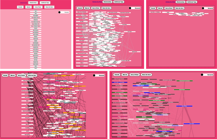
June 01, 2024The first interface was not very user-friendly and required some adjustments to make the site more understandable.
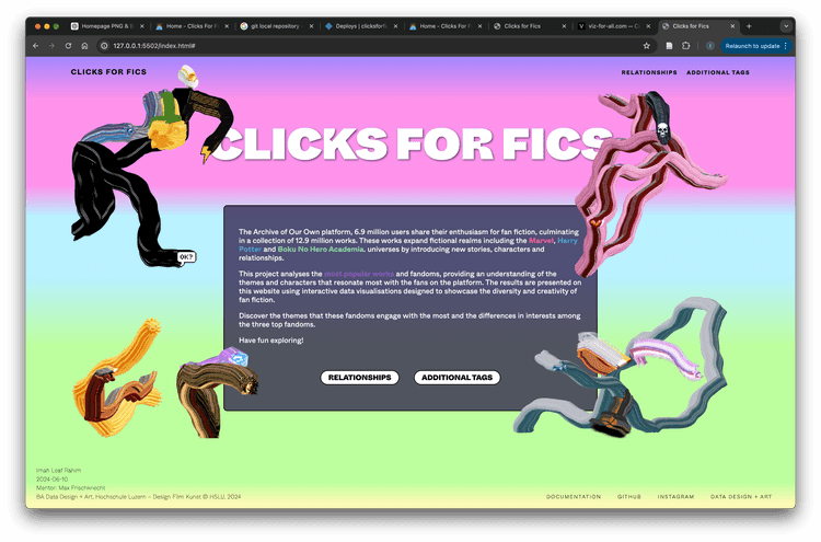
Therefore, I decided to combine my developed components into a new code structure, leveraging insights from the first prototype. For instance, it became clear that restructuring the navigation and separating the relationships and additional tags would be more effective.
In this step, my goal was also to use the fandom buttons solely to switch datasets within the sketch, rather than having multiple separate sketches. This provided a clearer and more organized structure for both the code and the interface.
The first step in this prototype was to implement the navigation and buttons, ensuring that the interface was functional and as planned, and understandable.
Next, I integrated my previously programmed network and additional tags logic into the website.
The process was primarily one troubleshooting session after another. I could spend an entire day fixing one error, only to have another part of the website break as a result.
I religiously saved everything on GitHub, allowing me to revert to an older version whenever something stopped working.
Without ChatGPT, I could never have achieved this so quickly, and I am grateful that I subscribed to the Premium version for data cleaning at the project’s start. My scripts became increasingly complex, and fixing bugs and finding and adjusting elements would have taken twice as long without assistance.
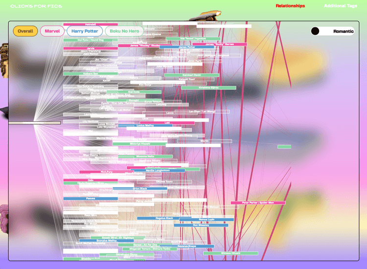
Once most of the elements were in place, I focused on adjusting visual layers and developing a color scheme to visually differentiate the data dimensions.
I also added some visual information, such as cursor and hover interactions, to enhance the visualization and interactions.
Colors and Data Dimensions
I struggled for a long time to find a color scheme that was both readable and visually appealing. Since I had five colors for the ratings in the background and needed at least four colors for each of my datasets, finding a schema that worked for everything was a continuous challenge.
Through many discussions with different people, it became clearer what was needed and which information was somewhat redundant and hindered readability.
Therefore, I decided to assign a specific color to each fandom and visually distinguish gender. Additionally, I used a single color for links between individual characters, as the node distinctions allowed viewers to identify the relationship categories (m/m, f/m, and f/f) on their own.
Legends and Text Data
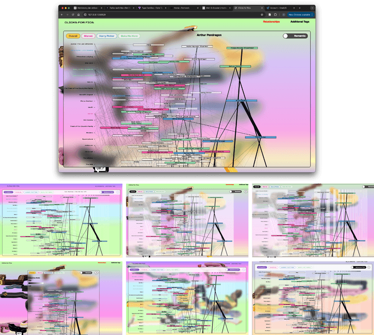
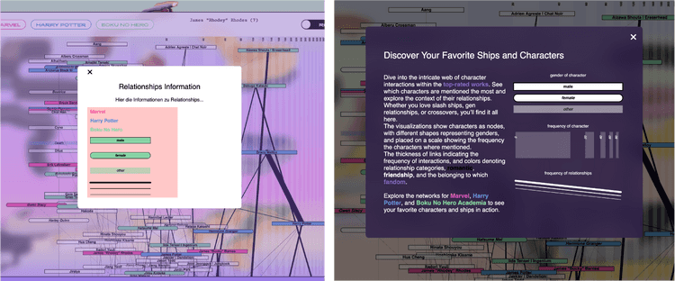
After integrating all these layers, I added textual information to explain what exactly was happening on the website and incorporated a form of legend and scale into my visualization. For the character scale, the x-axis along which characters are distributed by frequency, I decided to use a subtle shaded scale since I was already drawing enough lines in the visualization.
For the legend, I chose not to display it constantly but to make it accessible as a popup window. This way, users could refer back to it as needed without cluttering the interface.
User tests
Finally, there was the official user test, where friends of mine went through the process to identify aspects that needed tweaking or texts that needed rewriting.
I found that I had too few people in my circle who were exactly my target audience, and that AO3 was somewhat unfamiliar to them. However, I think this is also a good sign, because in the end they understood my prototype.
