Website Interface
April 23, 2024Website Inspiration
Since my target audience is the community itself, it was important for me to publish the project as a website to ensure broader reach and accessibility. The website is the medium that holds all my visualizations together and ensures connection with the target audience.
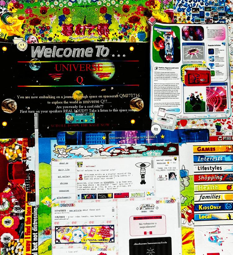
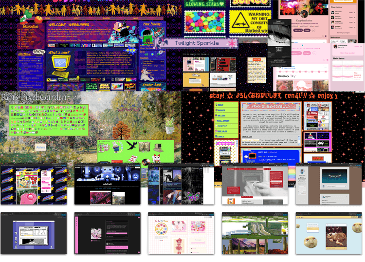
In the process of creating a website, there are important points I needed to address, one of the most crucial being how my project will be displayed and navigated. Given that the target audience of my work is the community itself, I wanted to establish a visual connection. However, I didn’t want to design something unique for each fandom but rather find a consensus for the entire community. Since many fanfictions are also seen on Tumblr and, in general, almost everything is found online, I decided to draw inspiration from 90s/Y2K websites and blog posts. I aimed to incorporate this in the form of color, text, and layout of the website.
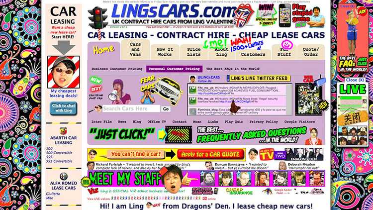
Therefore, I first delved deeply into understanding the website aesthetics I wanted to achieve and what already exists on the World Wide Web. Sites like Pinterest, Tumblr, Google, Neocities, and (one of my favorites:) lingscars were a significant source of inspiration.
I quickly noticed that a common denominator of these websites was that they usually had a background image with the website content displayed in divs in the foreground. I found this approach to be a good solution for incorporating multiple layers into my website and using the background as a form of data visualization.
Since this task occurred parallel to others, I continually revisited it from different perspectives. Especially the website interface was a long process that I repeatedly set aside when I realized that my network and data concepts were not fully developed.
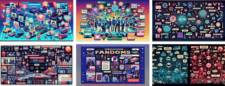
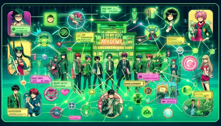
Therefore, I temporarily used AI to generate inspirational images of what my website could look like with multiple layers in the network.
Wireframes
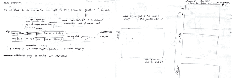
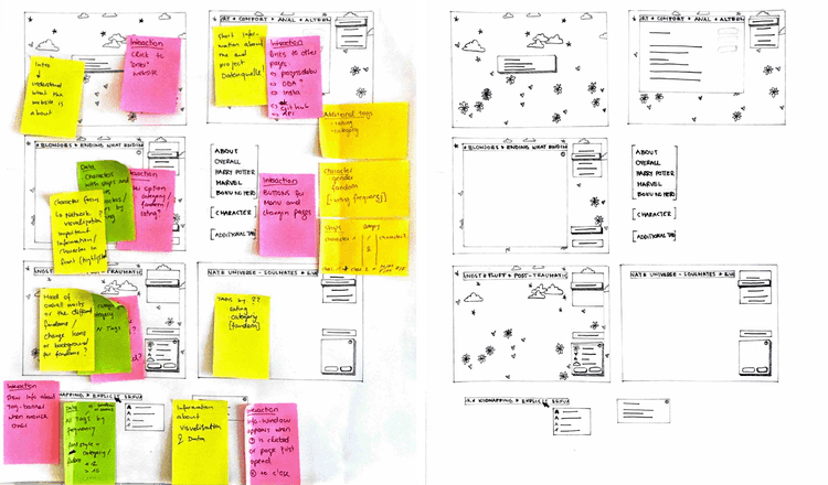
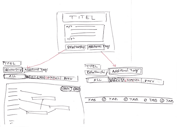
Eventually, I had to decide on the pages that should exist on my website and what data each page should contain. I then started developing rough wireframes for my website.
This step was also crucial for me as it gave me a better overview of where I needed specific data, how I needed it, and what interactions and subpages were necessary. When the rough interface was finally established, it marked one of the first major milestones, guiding me in the right direction and making me realize that my project was finally taking shape.
