Additional Tags
April 28, 2024Visualizing Categories
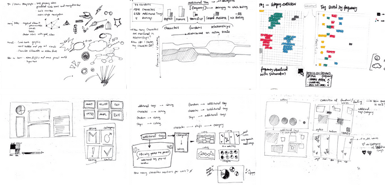
To understand the interests and needs of AO3 users, I needed to categorize and visually represent the tags. This required exploring different design approaches and tools. Initially, I had to decide between using text or images, given the variety of categories.
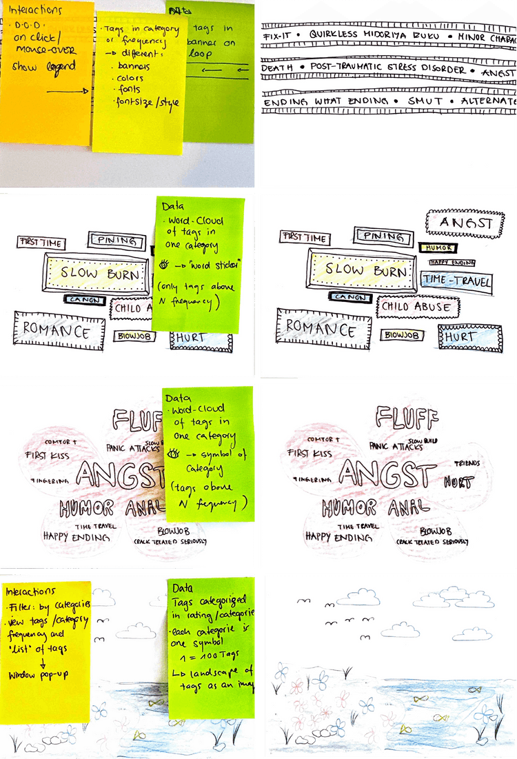
I started with cautious sketches, considering only frequently occurring tags to narrow the scope. However, I quickly decided against a text-based visualization as it might resemble the network visualization too closely.
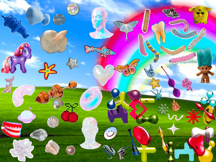
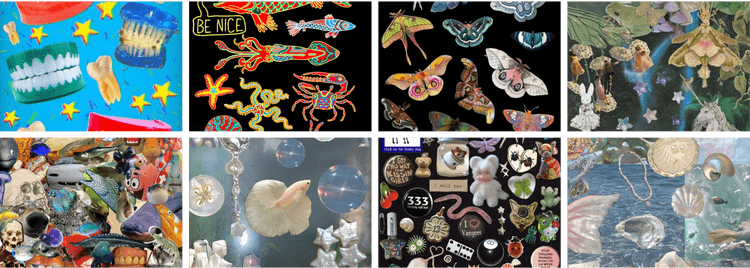
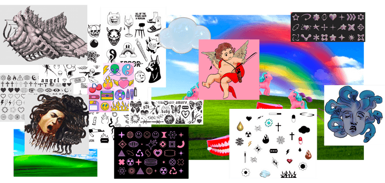
Thus, I explored using images and icons to represent my categorized tags. My initial inspiration came from pixel art and collages found on 90s and Y2K websites. Y2K symbols, in general, were also an early inspiration.
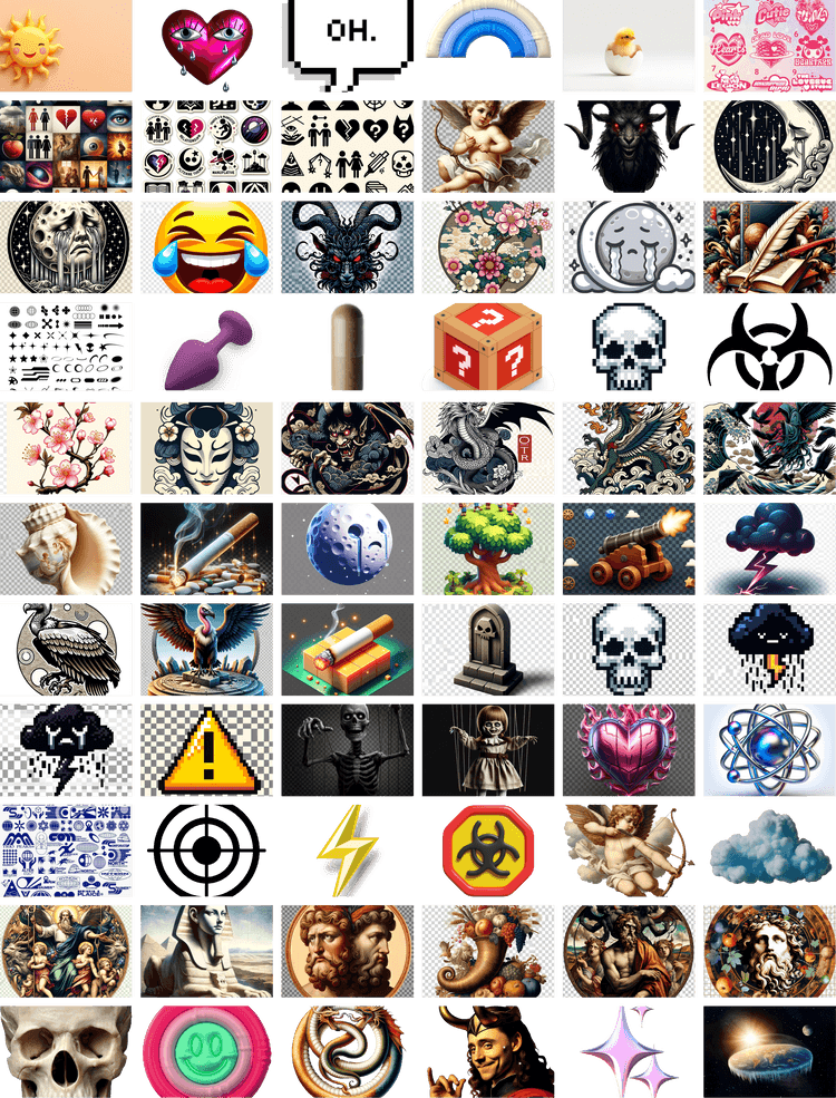
I experimented with various symbols and meanings. From classic Y2K symbols to Greek mythology and Tarot card meanings, I tried different approaches. It was challenging to categorize the tags and design the visual elements simultaneously, as nothing was finalized.
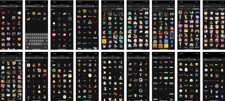
In addition to researching meanings for categories, I tested various methods, from Google images and Illustrator drawings to 3D objects and AI-generated images. Over time, I realized I needed to view the images together and in quantity to determine which ones made the most sense.
Combining My Tags
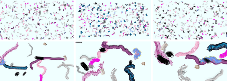
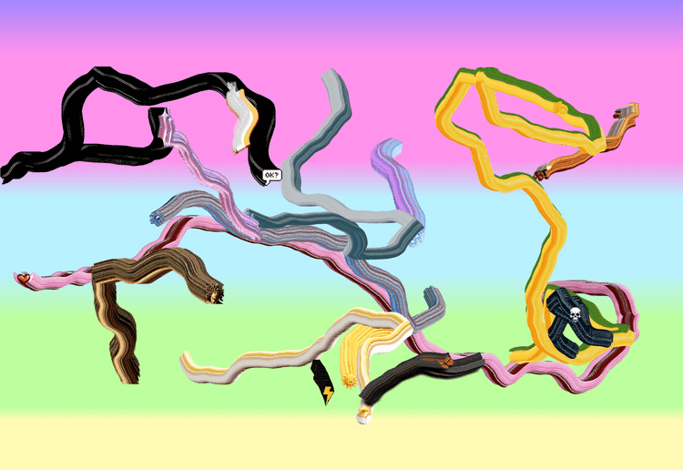
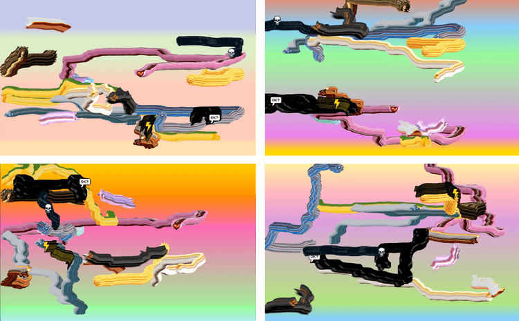
To combine my tags effectively, I wrote a short p5.js script to draw the images based on data.
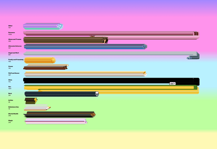
I noticed that some order was needed to get a better sense of the frequency of tags. Even though my goal was never to make it perfectly readable, I still wanted to convey a certain mood, indicating differences.
Within this code, I continually adjusted and changed my images, realizing what worked and what didn’t. Eventually, I found a distribution of various images that conveyed the mood I was aiming for and matched my categories.
I initially decided on this somewhat chaotic visualization because I found it visually appealing. However, I realized late in the process that I needed to switch to a more ordered pattern to better compare categories and fandoms.
Ratings
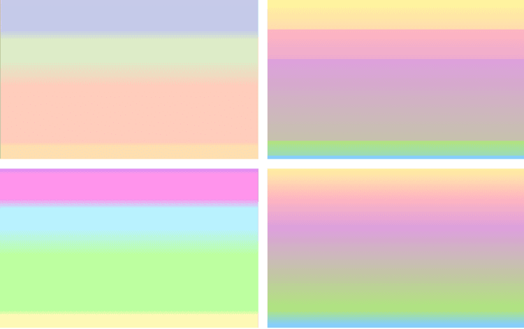
Besides the tags, I believe the distribution of ratings across different fandoms is an indicator of what fans enjoy reading. Therefore, I considered representing the ratings as a color gradient in the background. Again, it was not crucial for it to be precisely readable; the goal was to give a general sense, for example, that Harry Potter has significantly more Explicit and Mature content than Boku No Hero.
The color scale for ratings had to be continually adjusted to match my node color scheme and the overall website to ensure the readability of the entire site remained intact.
