Visual Analysis
April 16, 2024Visualized Overview
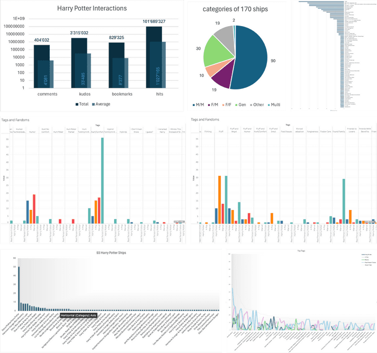
Alongside cleaning and organizing the data, I also created some quick standard visualizations using Tableau, Excel, and ChatGPT. This helped me quickly understand what I was working with and identify interesting approaches for my project.
First, I visually analyzed my data again to determine if the points I wanted to focus on were indeed interesting.
I found that there are indeed differences between fandoms, characters, and relationships in terms of tags and ratings. This reinforced my initial decision to focus on these points.
Since I was already using Excel to prepare the data for my overview analysis, it seemed logical to try visualizing the data there as well. However, not all data was well-suited for visualization in Excel. Therefore, I tried using Tableau, but I found it even more challenging to visualize and summarize the dimensions as I wanted.
As a last resort, I used AI to visualize some of the information. This seemed to be the best solution to quickly visualize the data in a way that allowed me to gain visual insights.
Visualizing Relationships
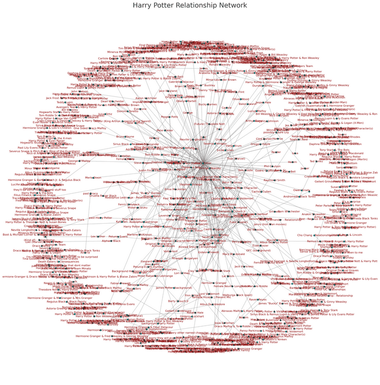
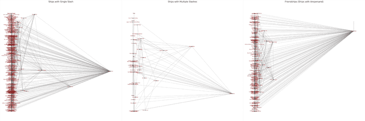
For visualizing relationships, I used AI to quickly create visualizations of my relationship datasets to get a sense of the network and the scale of the relationships. It was challenging to gauge the scope from just the rows in an Excel sheet.
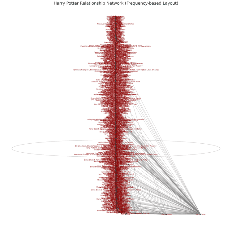
I quickly realized that a force-directed network was not the best choice for making the data easily understandable, as one of the key points for me was to represent the frequency of characters and relationships.


